UX Forms provides an exhaustive set of user interface widgets out of the box, which you can see in action in our pattern library form. We also realise that, no matter how many we provide, there will always be some forms that need something special. In this article we’re going to go through how to compose existing widgets and behaviour to create an entirely new user interface widget. Namely one that can conditionally reveal other widgets within itself.
Conditionally revealing content
Whilst UX Forms already provided checkbox and radio group widgets, as well as the ability to show and hide any widget based on answers to previous questions, we didn’t provide a widget that could combine the two in a single question.

A pattern that we’re seeing used more and more is one where the conditional question can be displayed within the group, just below the selected item.

So, let’s go through the process of building a new, custom, widget to do just this.
What does our widget need to do?
Well, we need to be able to include a form field between options in a multiple choice widget, i.e. radio groups and check boxes. We really ought to be able to leverage all the goodness of UX Forms’ built-in widget behaviours like widget compose-ability, validation, rendering, full internationalisation, etc., to build this up.
The first consideration is how the nested/conditional widgets should be related to the multiple choice widget. Given that the multiple choice’s options typically come from an internationalised properties bundle, and that different locales can have their choices in a different order, we’re going to have to associate our nested widget with the key of the relevant choice.
Messages.So, it makes sense that we should be able to pass a map of String -> Widget to our multiple choice for its nested widgets.
Composing existing widgets and behaviours
Both theCheckbox and RadioGroup widgets are instances of the MultipleChoice trait which adds in behaviour over and above “regular” widgets that is unique to UI components that ask you to choose between multiple options. So we’ll definitely need to make use of this somewhere.
But our new widget also needs to know how to handle more widgets nested inside itself. It turns out we have a common trait for that, too, called WidgetGroup. Used by the WidgetGroup, er, widget, it handles how to save nested widgets back to the platform when a section is submitted, and how to perform validation on all of its nested widgets. So we’ll need one of these, too.
In fact, let’s start with a WidgetGroup. Given it already knows how to handle multiple widgets in one go, let’s try that as our base.
We can see our nested widgets is the map of String -> Widget, and there is a member for a MultipleChoice widget. Then widgets, inherited from WidgetGroup, is made up of all the nested widgets as well as our multiple choice widget. This should get all the multi-widget behaviours from WidgetGroup that we need and ensure that the form behaves as expected regardless of the type of widget that we want to nest.
MultipleChoice has a function called choicesForTemplate which iterates over the Messages passed to the widget to use as its choices and converts them to key-value pairs for use in the widget’s template. We’re going to need to extend this function somehow to also render the associated nested widget for each choice. Unfortunately the existing function doesn’t take enough arguments to be able to call render on our nested widgets, so we’re going to need something else. Let’s add that to our new trait.
So far so good, but we haven’t told our new widget how it should be rendered. Given we’ve rendered the nested widgets already and added them to the template parameters for each choice, we can let the multiple choice widget take care of how to render everything together.
Which is as simple as delegating our NestingMultipleChoice's render function to that on our member MultipleChoice widget.
Building the Nesting Checkboxes widget
So now we have a bunch of common behaviour in NestingMultipleChoice, let’s put that to use by actually building a nesting checkboxes widget.
Which is nearly but not quite enough. The provided Checkbox widget calls its own templateChoices function to add them to its template, whereas our new nested multiple widget needs to use the one from NestingMultipleChoice. So we can override Checkbox's render function to call the right one.
Then, finally, we need to create a template for NestingCheckboxes which includes the new parameter for the rendered nested widget.
Putting it all together
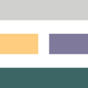
Whilst we have a working checkbox that can take nested widgets, to build the example from the top of this article we need to do one more thing — make the input text field appear inset with a grey border. Our GOV.UK theme already has the styles to do this, so it’s a matter of using a different layout template with the existing Input widget to use different css class names on the right elements.
Then, finally, in our form definition we can use our shiny new nesting checkboxes widget. In fact, this is the very code used to build the form captured at the top of this article.
In conclusion, we’ve demonstrated how relatively complex UI behaviour can be built up quickly by re-using existing behaviours and widgets in UX Forms. The way that a form’s sections are composed of Widgets whose behaviour is, in turn, built up by mixing in traits provided by the platform, demonstrates the real flexibility and power of UX Forms. And then, for the rare cases where the built-in behaviour is not enough, form authors can even override specific widget behaviour to get exactly the functionality they need.
This is what we mean by Complete control. Instant insight.

NestingCheckboxes widget containing two input widgetsWant to know more?
Come have a look around https://uxforms.com, follow UX Forms on twitter, or email us at hello@uxforms.com and see how we can make your forms better, together.